We needed to convert more visitors to members, and that all started with how we said "hello"
LendingClub is a pioneer in fintech, specializing in personal loans, with more than 4 million members and over $70 billion in loans originated. The fintech space had become crowded since LC's inception and the company was feeling the pressure from growing competition.
My Role
Lead Product Designer
I led a team of three designers, and partnered with UX research, brand, and product leadership to develop strategy, experience, and visual language.
Narrow focus — big gaps
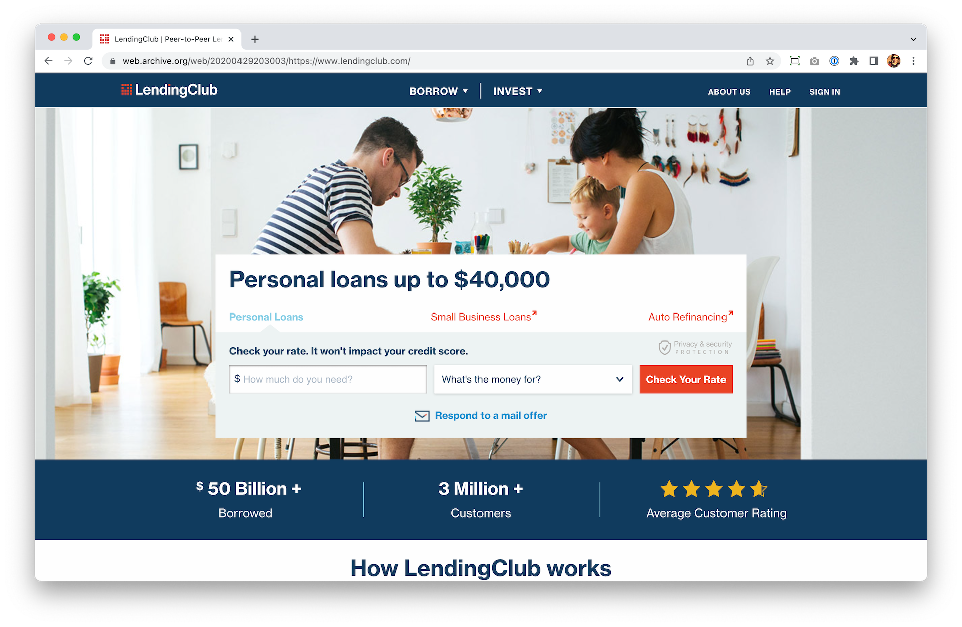
LendingClub's homepage did one thing: let people apply for a personal loan.
It worked for highly informed people, but that wasn't representative of the majority of our visitors. The page provided little to no context of who LendingClub is, the details of personal loans, or information on how our suite of products could help.
From a whisper to a scream
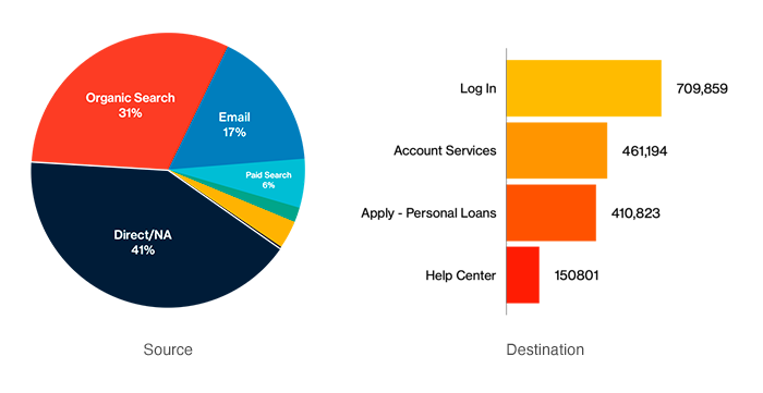
Data showed sources and top actions on the homepage but the eye opener was learning that roughly 10% of homepage visitors originated via the personal loans homepage.
More simply: they'd landed directly in the loan application (e.g. from Google, partner site etc.,) decided NOT to apply, and instead made their way to the homepage.
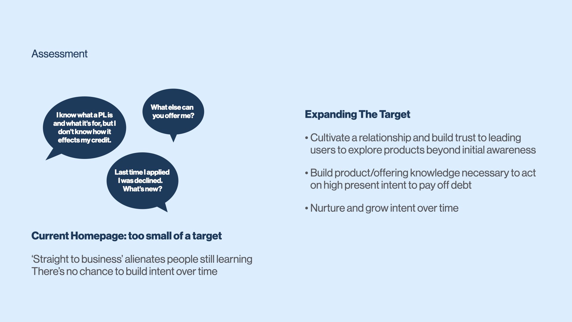
Users were not confident moving forward because they didn't feel informed
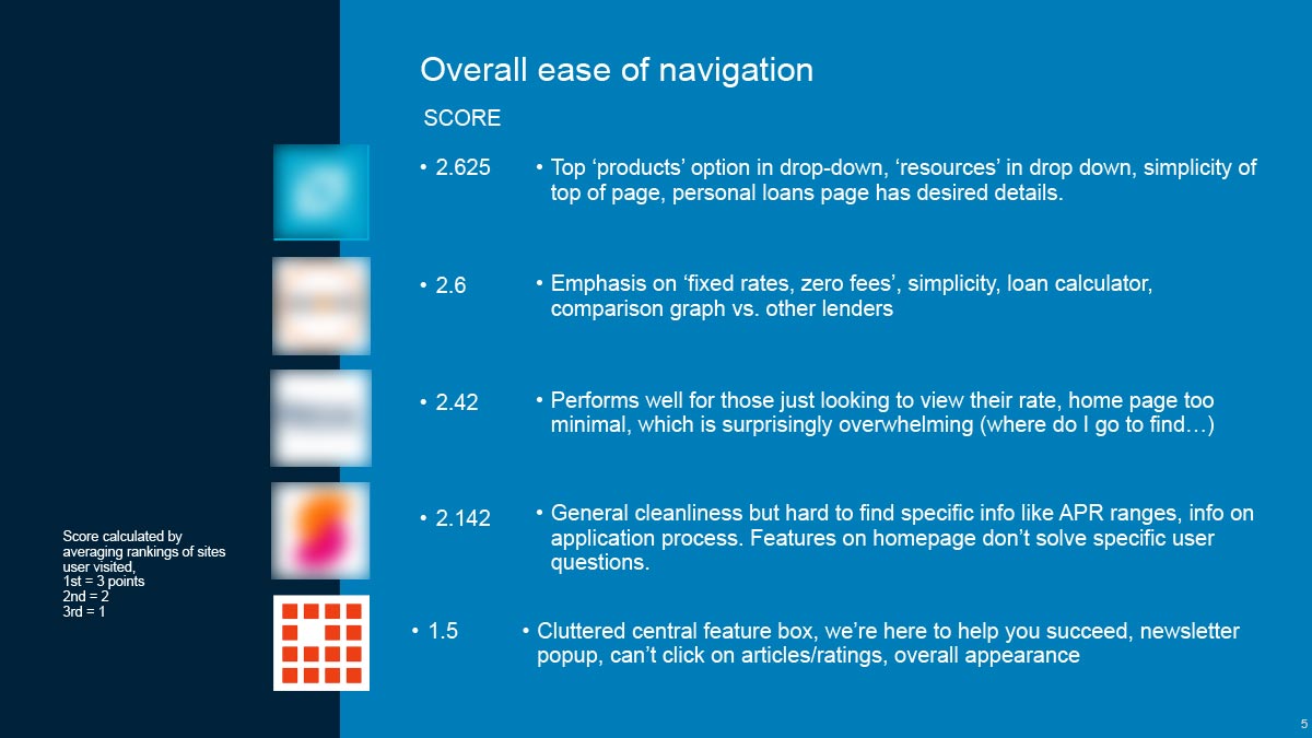
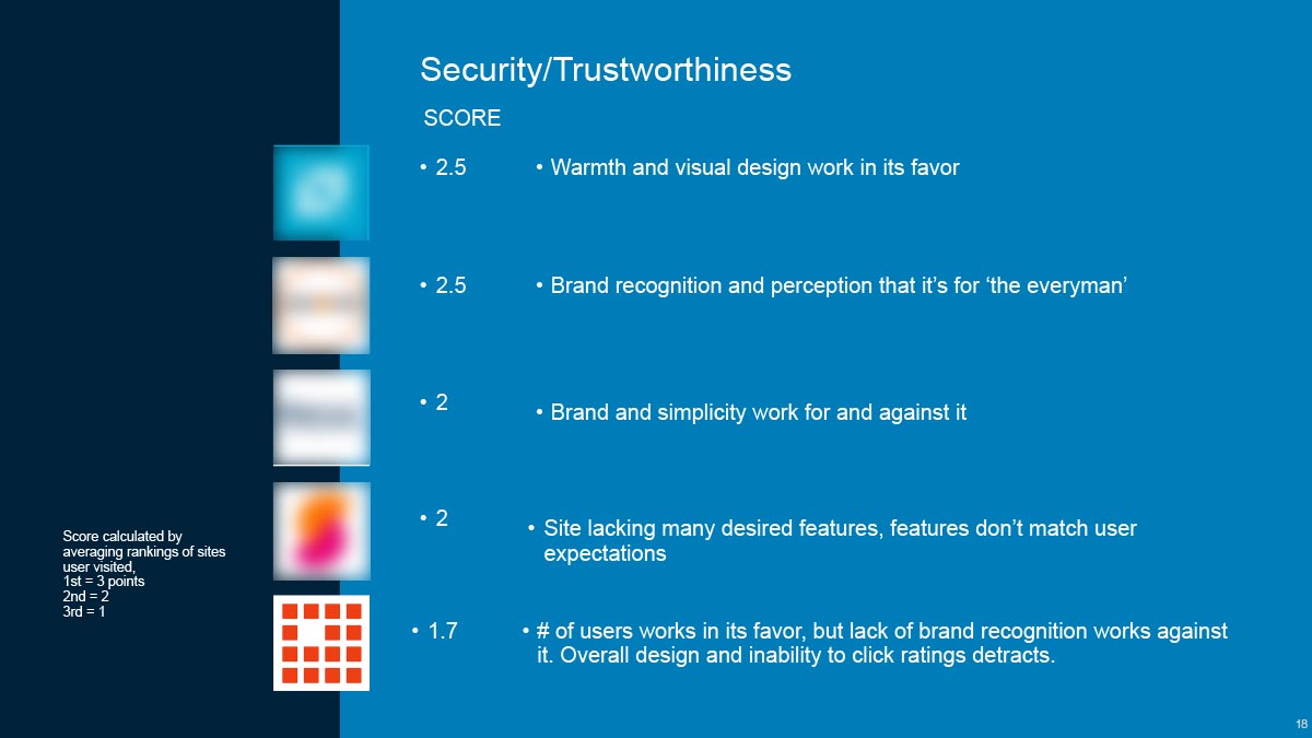
We interviewed 15 high intent prospects completing task-based assessments and noting usability issues.
We then asked them to use our homepage, as well as those of several competitors, ranking them on ease of navigation, trustworthiness, and content. In every category, the LendingClub homepage scored the lowest.
We identified five objectives to improve UX and drive growth
01 / Serve as the primary entry point to the product and provide a compelling introduction LendingClub.
02 / Persuade users to apply for a loan or engage further with us.
03 / Provide content to guide and reassure users, proactively address questions, and offer clear options to learn more.
04 / Build trust and credibility.
05 / Set a foundation for the financial health ecosystem.
Meeting people where they are
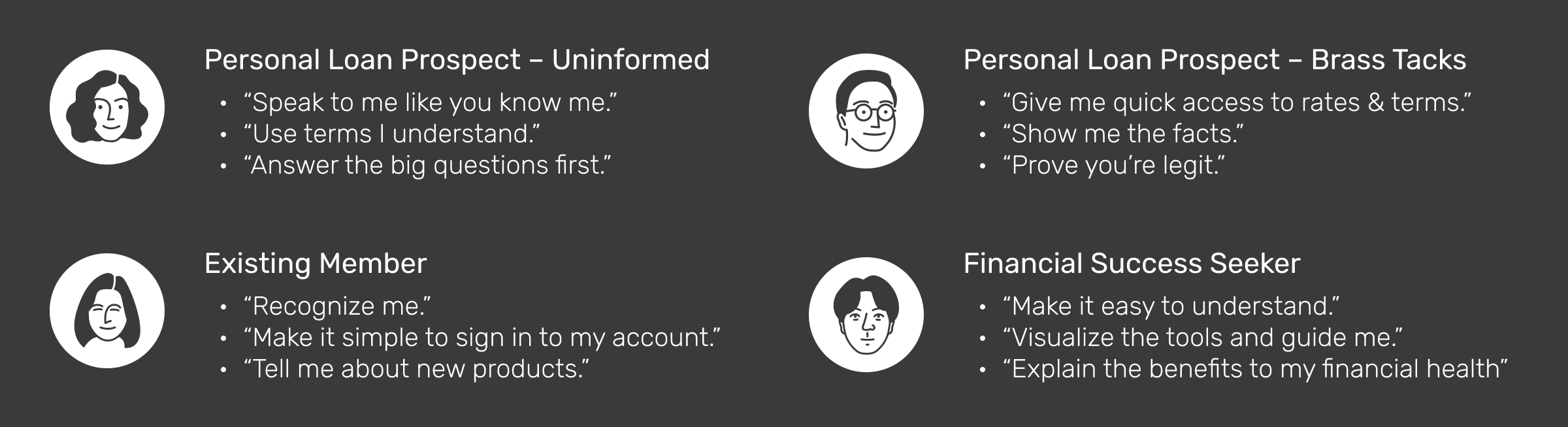
The reasons for considering a personal loan were varied. Some were for leisure, but many others were for more critical needs, like debt consolidation. We wanted to address as many users as possible, so our personas were designed to cover the majority of our user base.
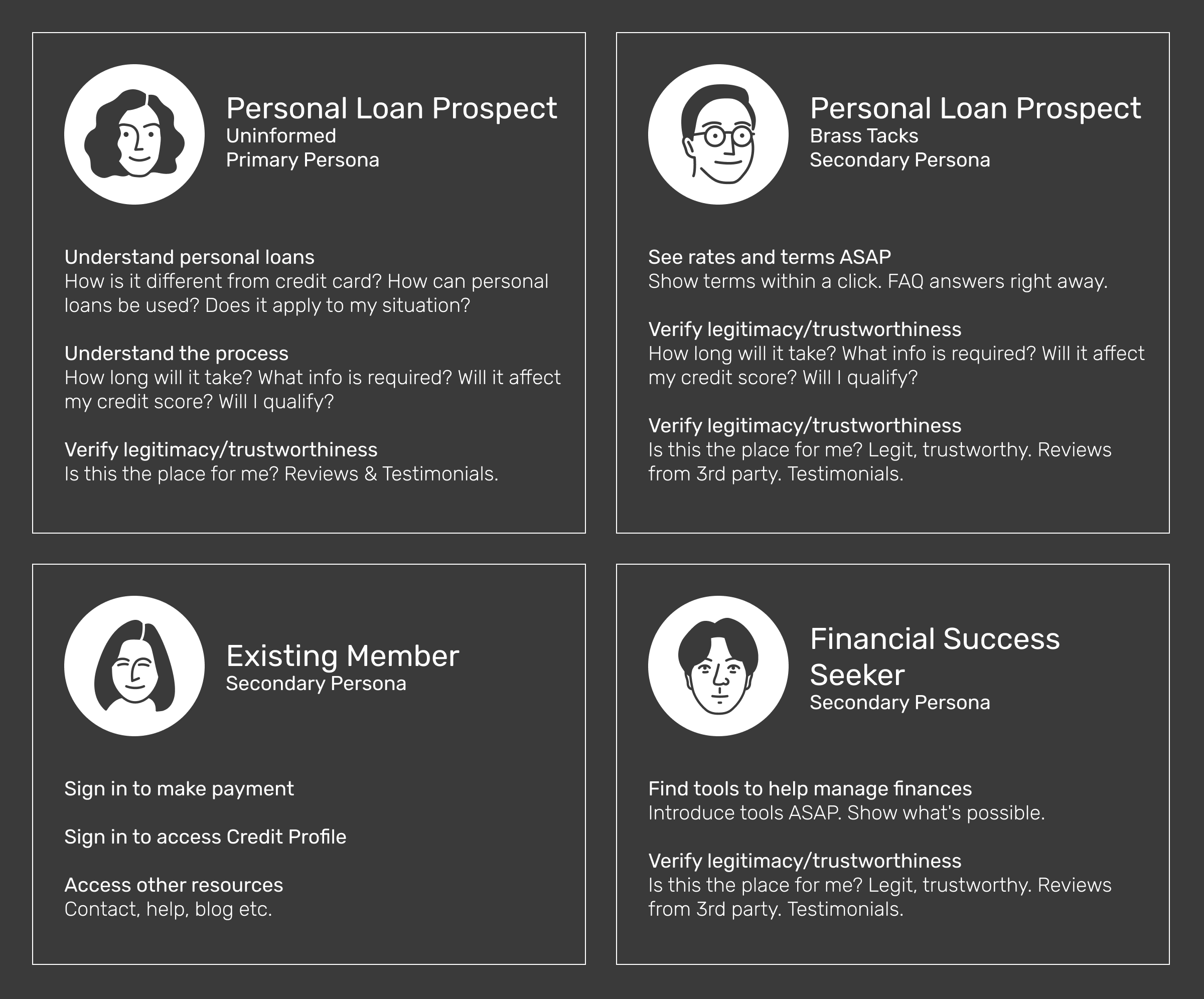
I paired personas with "statements" as an empathetic way to guide the team toward our users
Beginning to see the light
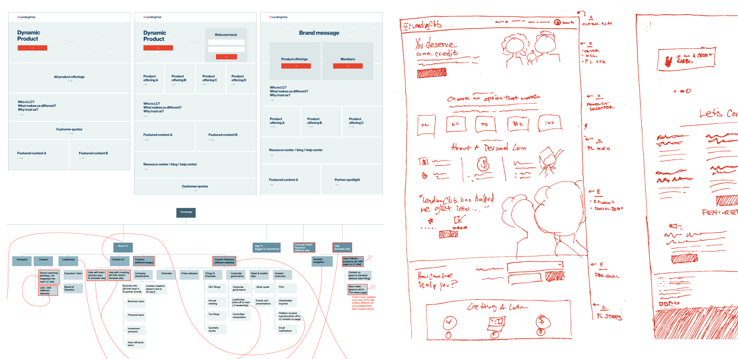
We needed to strip away complexity, and deliver the information users wanted quickly. We reviewed the underlying IA, then layout sketches and wireframes were created alongside content strategy. We would lead with our core loan product, while incorporating messaging that spoke to each of our personas.
I designed two concepts that were clear, functional, and brand forward
Concept one, Tesselation: Clear and inviting this approach extends the brand visual language.
Concept two, Monochrome Set: Bold type and floods of brand color highlight product offerings and membership value.
Both concepts shared a set of features that signficantly improve the user experience
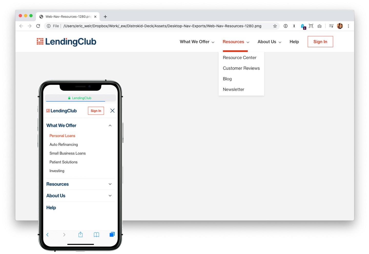
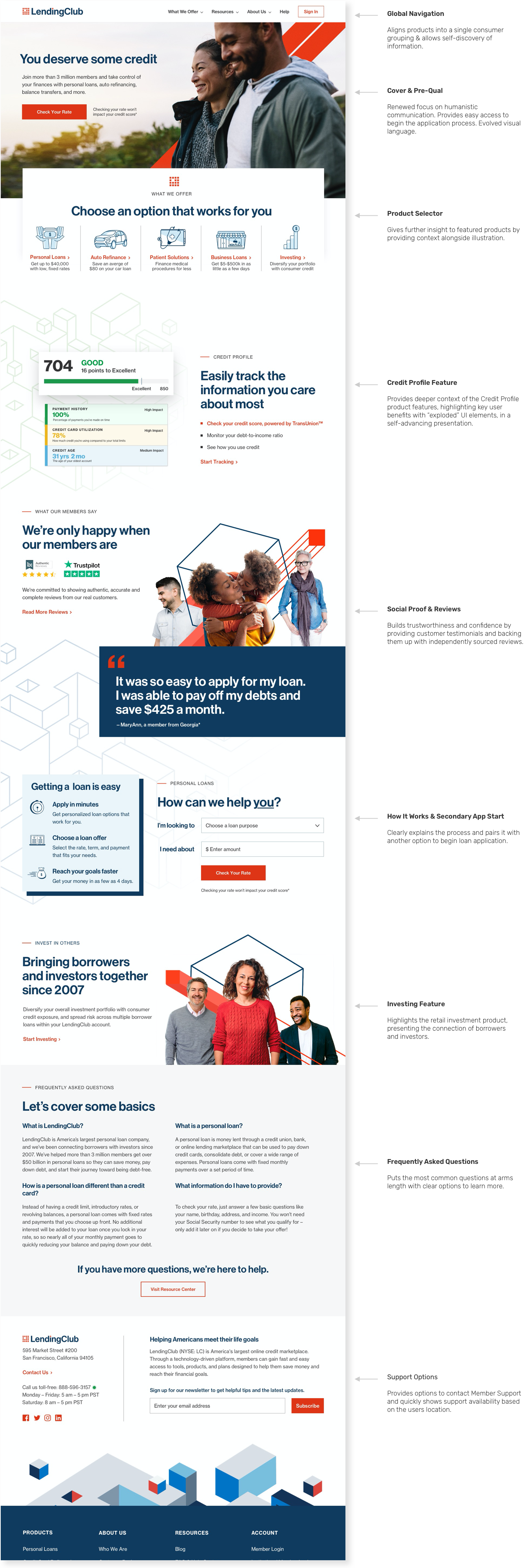
Global navigation
A universal navigation paradigm for the entire product lets users move around easily and access key information from anywhere.
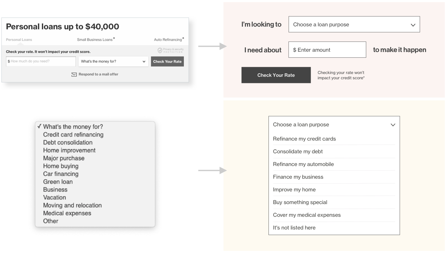
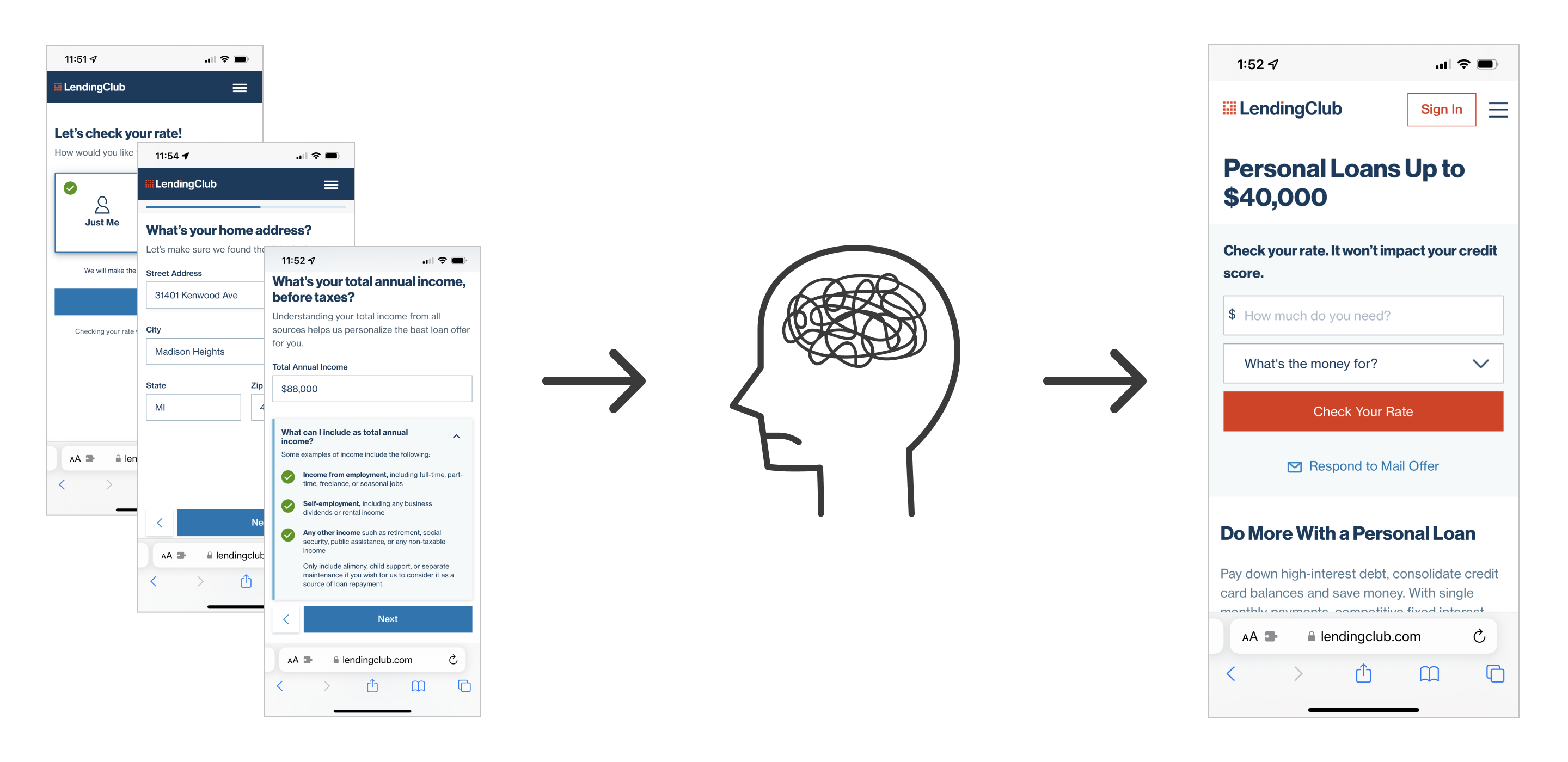
Loan application
Prospective borrowers must provide the amount and purpose of their loan to apply. Research showed users found the current design cluttered, overwhelming, and crass.
I designed an interface that makes the process feel more conversational than transactional. I also re-wrote loan purposes to more realistically match user needs, not loan categories.
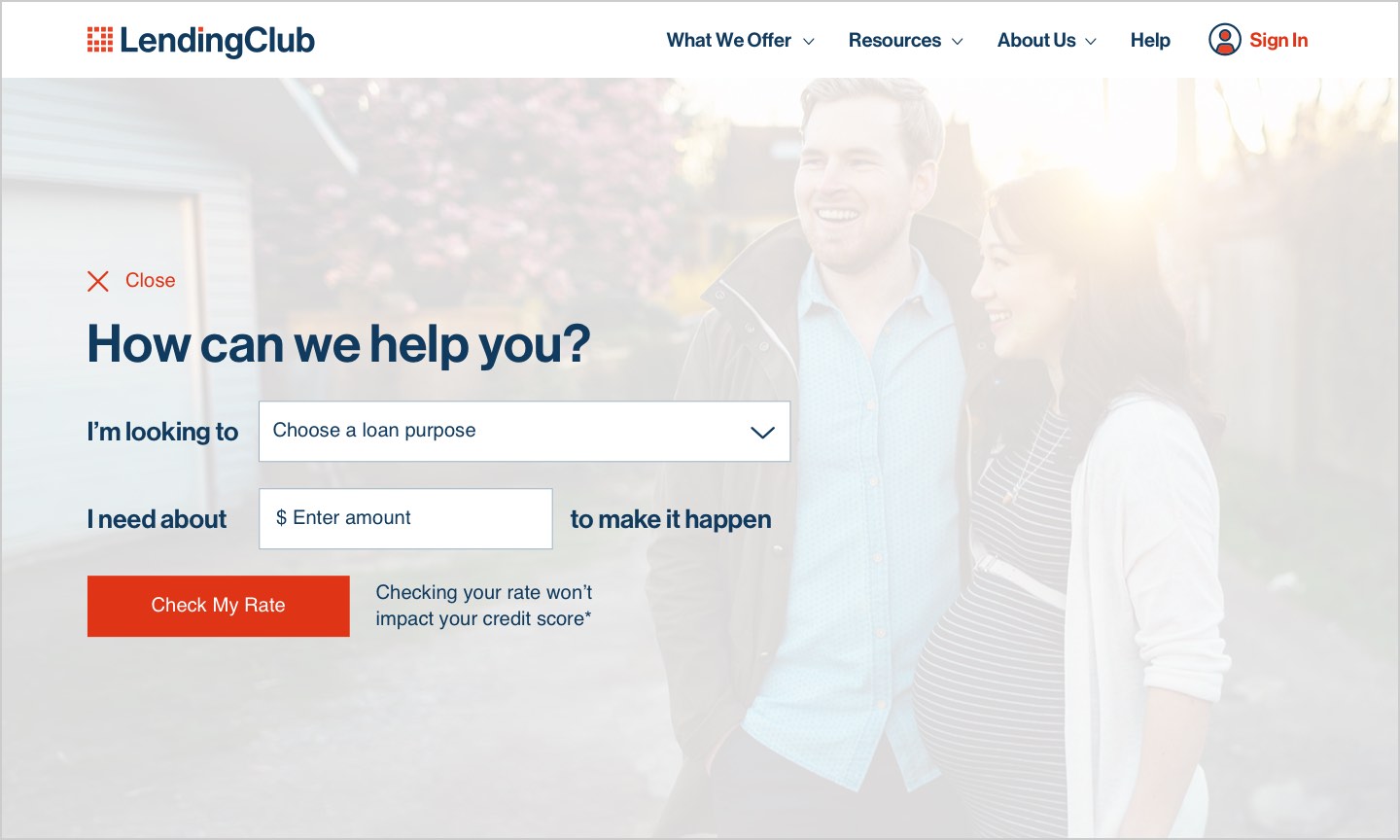
Apply and discover
Instead of directing users to a separate page for the application process, we start "in situ", overlaying the homepage cover. This allows users to get started immediately, but also learn more without requiring they find their way back to the homepage.
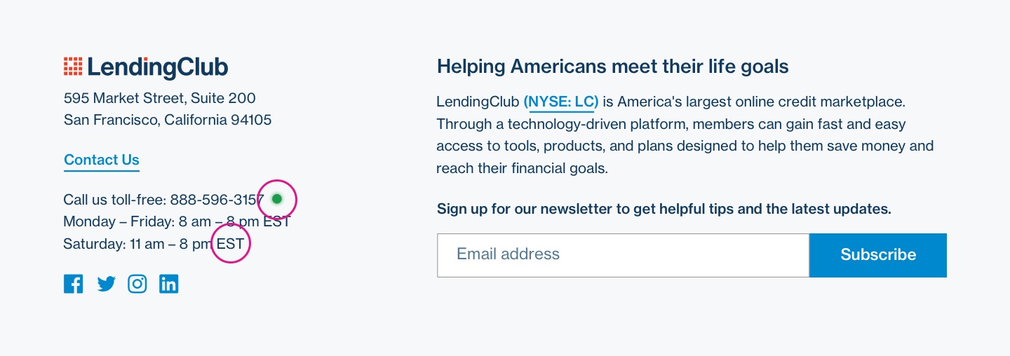
Member support access
Users want to know they can quickly reach support when they need it. I designed a module providing contact information, and showing live support availability. Hours of operation are shown in the the users' local time, and a visual indicator shows if Member Support agents are available.
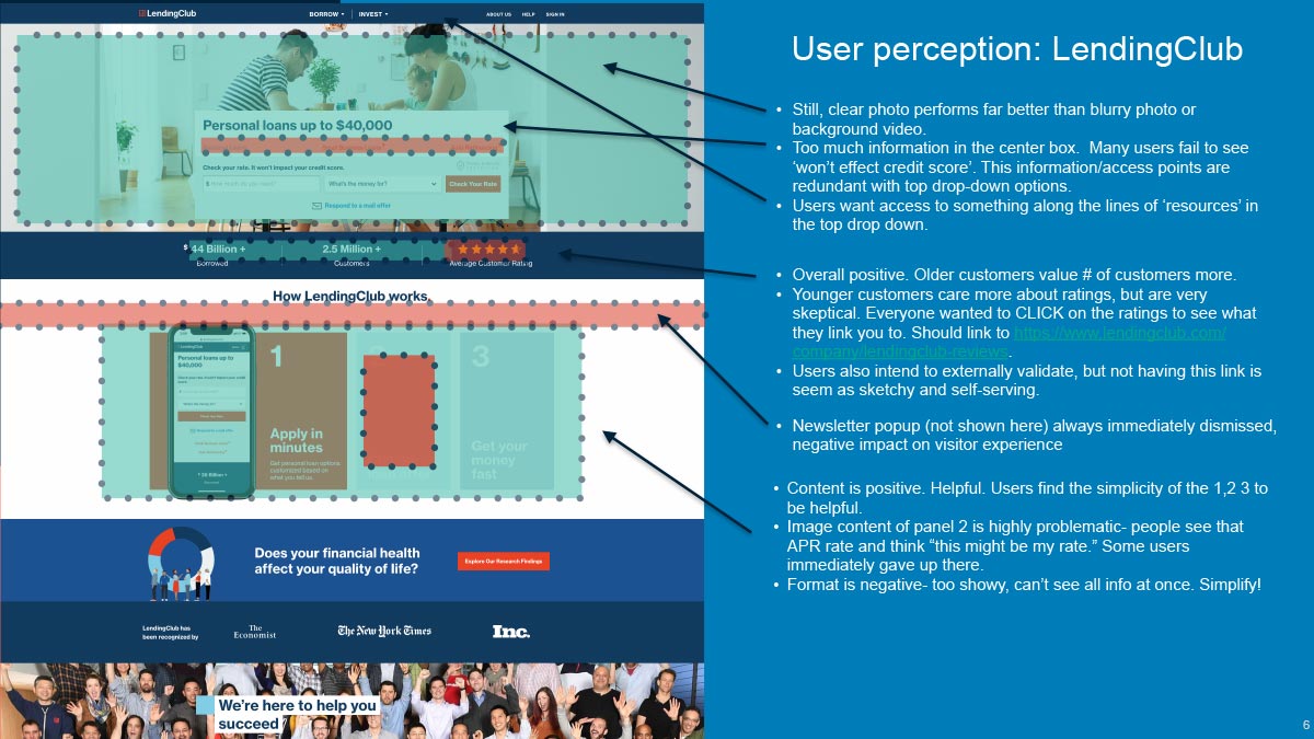
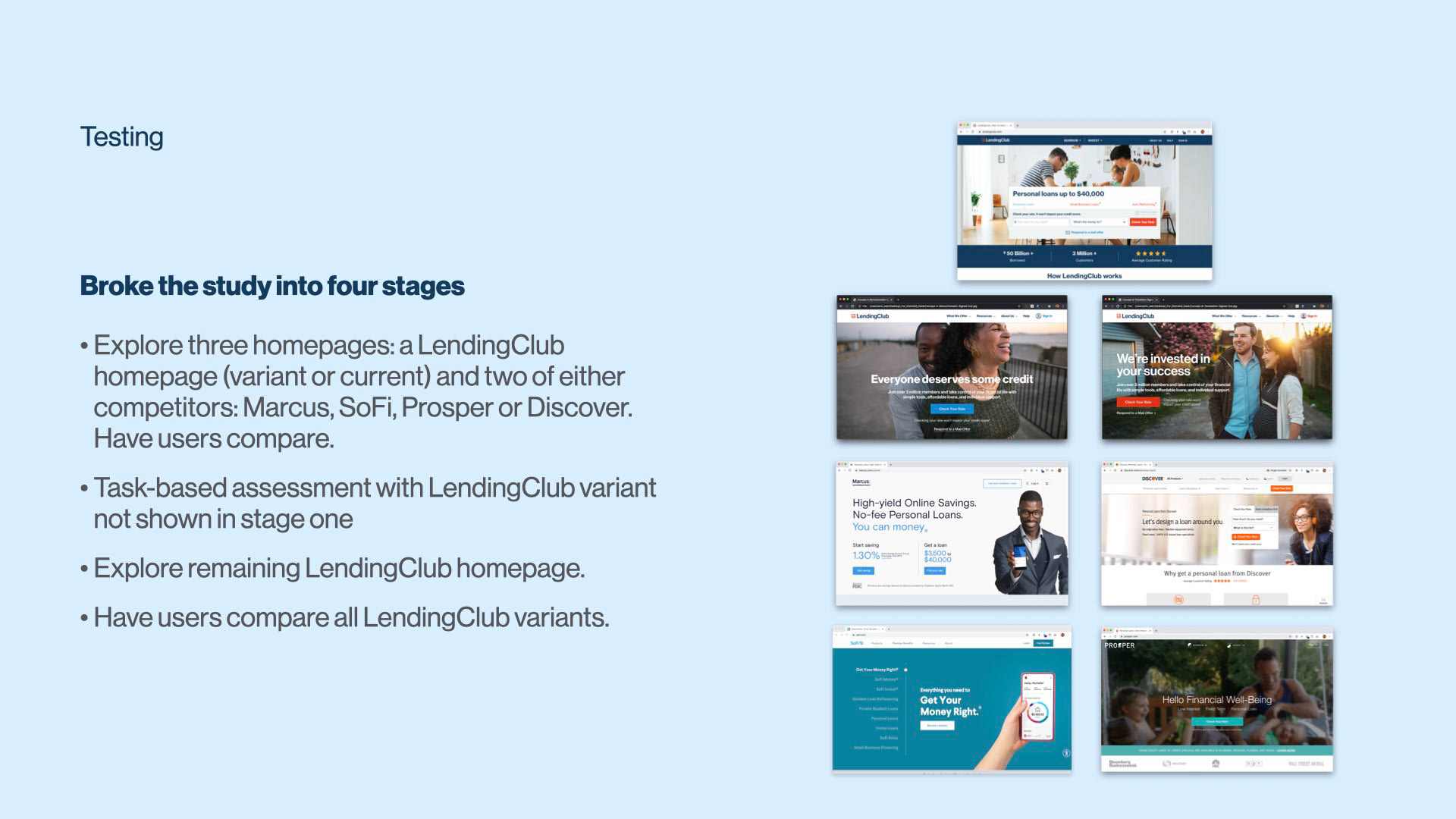
We tested designs with high-intent prospects to gauge overall satisfaction and usability
Interactive prototypes allowed users to "drive." We broke the study into stages (explore, operate, compare) and presented a mix of LendingClub designs as well as those of competitors.
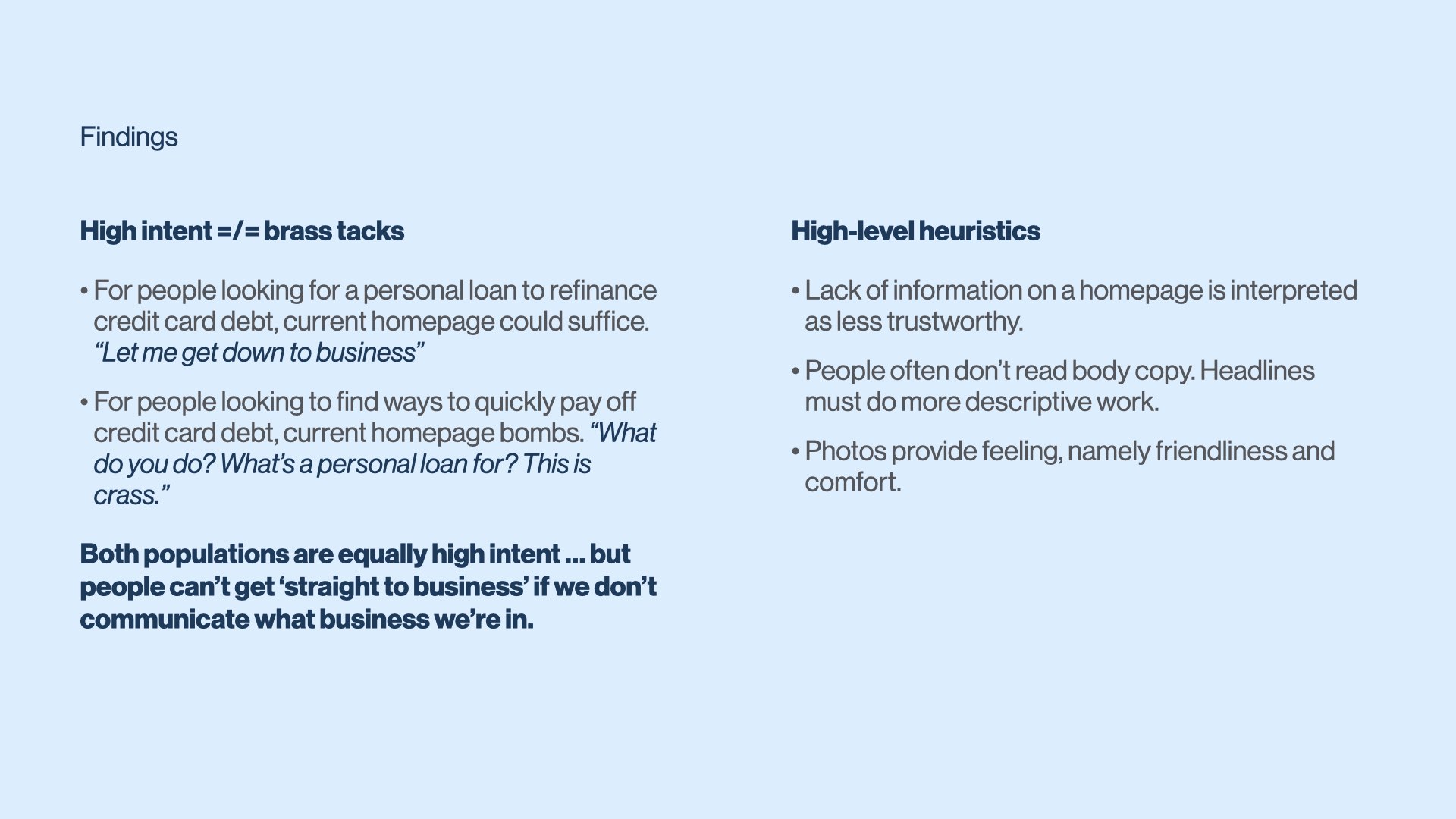
Key takeaways
Global navigation is a big win. Users easily understood the categories and could quickly complete tasks. It became the standard by which they judged navigation.
People evaluate what you can do for them based on what you offer. Having products other than personal loans increased user perception that we could help them.
Too much focus on member stories makes us seem less trustworthy. Users wanted a combination of independently vetted reviews and testimonials.
Financial tools were well received but users didn’t understand them. Users wanted to know what the tools offered more explicitly.
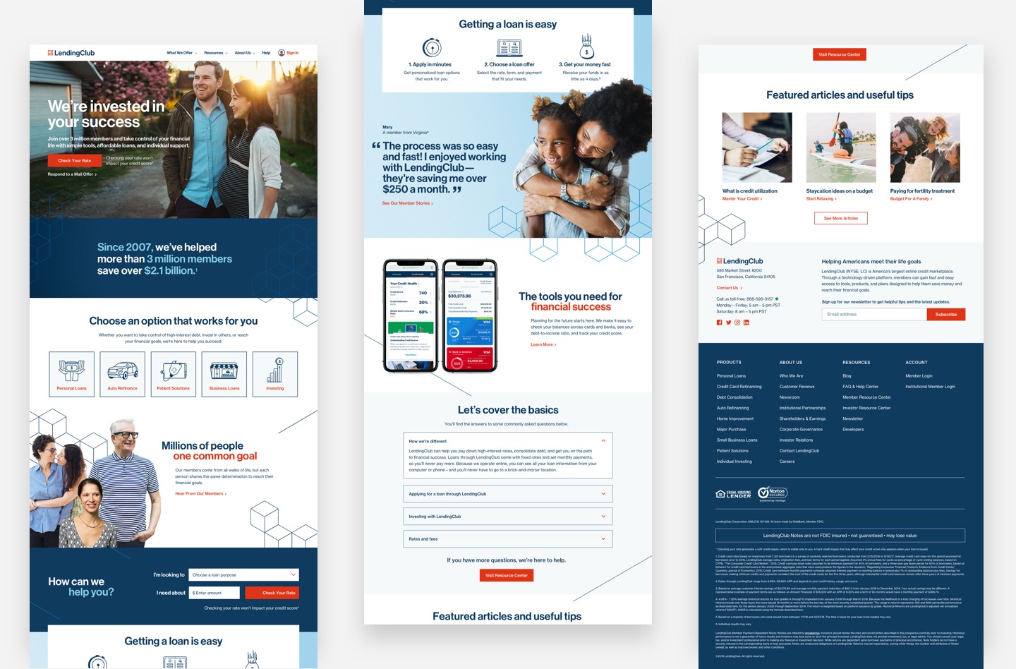
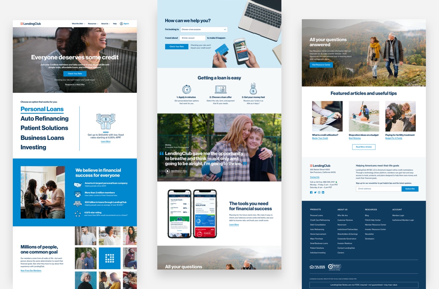
Our final design was thoughtfully informed by user needs and reimagined LendingClub as a human-centered brand
An unprecedented event
As we were sprint planning for the homepage, COVID-19 pandemic hit hard. LendingClub made a business decision to delay development indefinitely. Since that time, I've moved on from LendingClub.
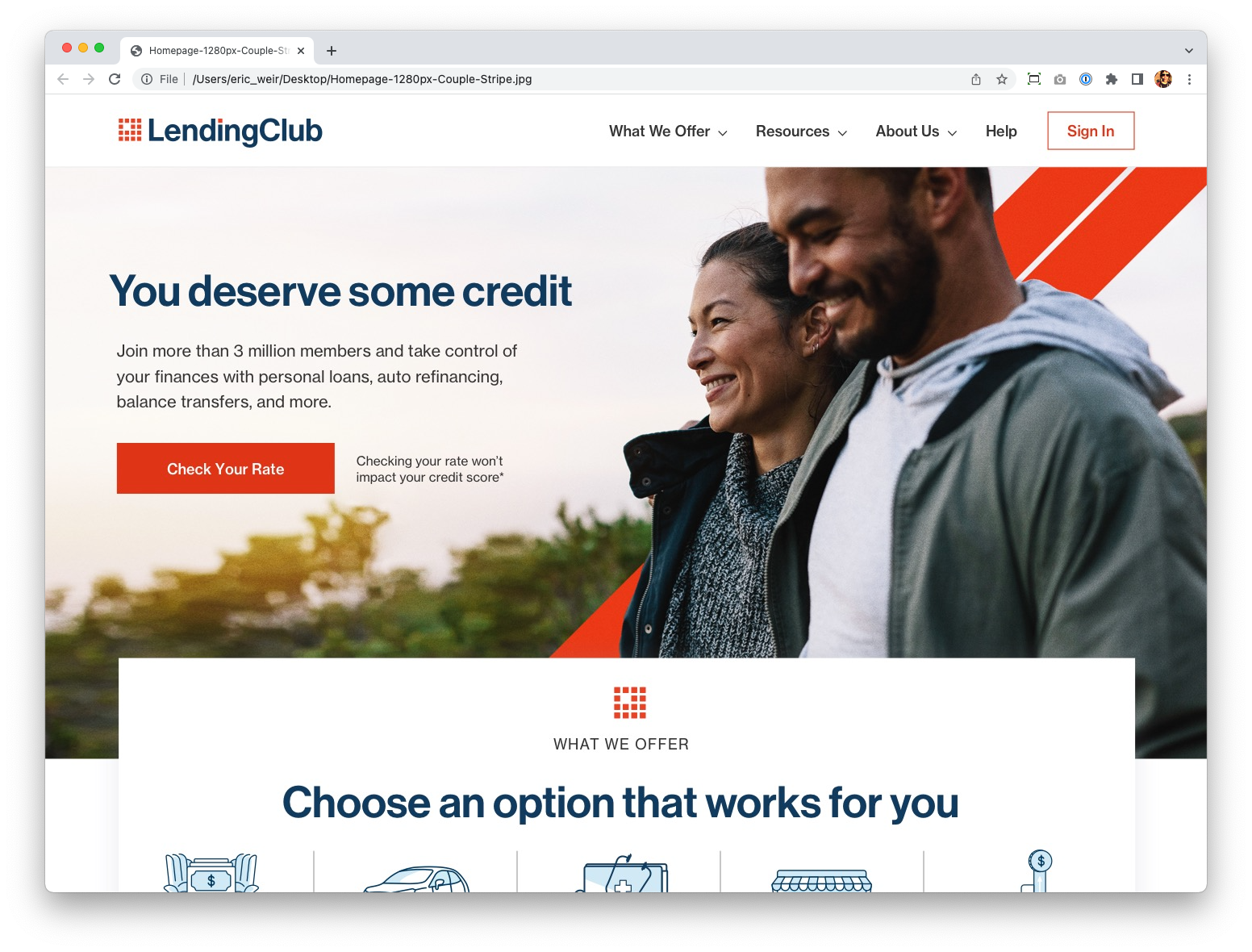
To my delight, several elements of the redesign recently appeared in a updated homepage: navigation, social proof/reviews, FAQ, etc. A little birdie tells me that since those changes went live NPS scores have improved by nine points. LendingClub has gone on to a record-high quarter in revenue.
Not a perfect ending, but I'm incredibly proud of the work. The updates that LendingClub made were directly from our designs and validate that our approach was correct. Hopefully the full site goes live one day!
A neutron dance for a neutron fan
Want to chat? Get in touch!
©2026 Eric Weir
All product names, logos, brands and designs are property of their respective owners. All company, product and service names used in this website are for exhibition purposes only. Use of these names, logos, and brands does not imply endorsement.