LendingClub Navigation / Overview
A better way to navigate
Users were lost and needed a clearer way to find what they were looking for
Like street signs in a city, navigation builds conventions that allow users to decipher where they are. It tells the them implicitly how to get started and what the options are. It should be all the instruction they need. Unfortunately LendingClubs' product needed a user manual.
I was principal designer, working alongside PM and Engineering.
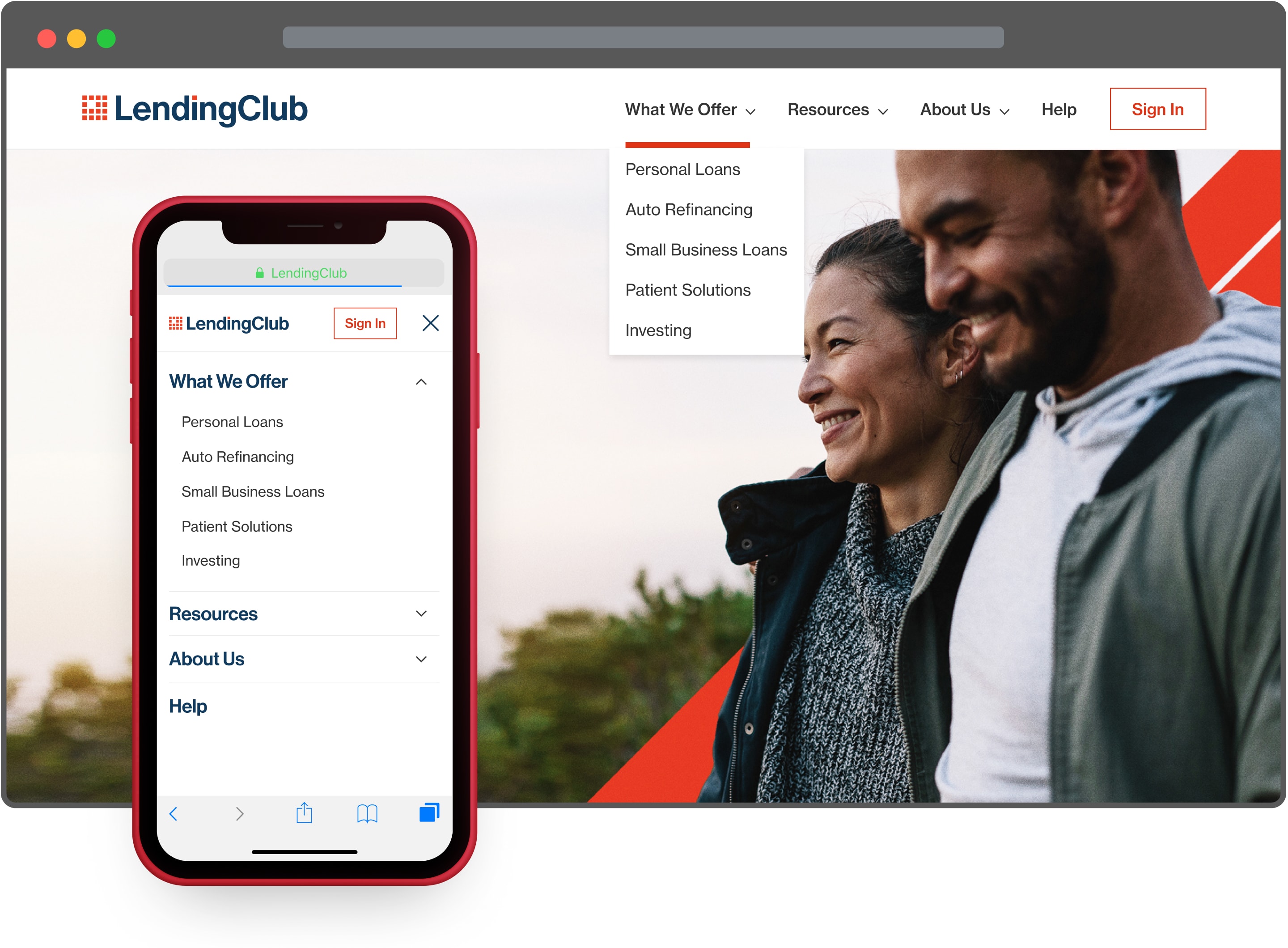
Destination unknown
Users were frustrated with the inability to find what they needed and were confused by the product options. The navigation didn't match their mental models.
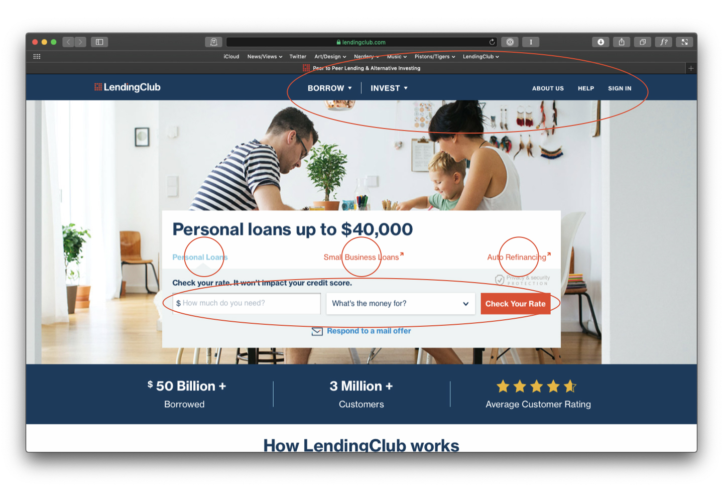
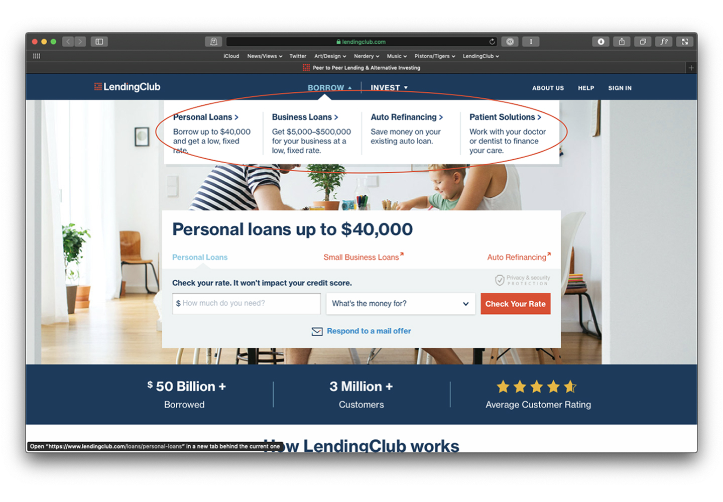
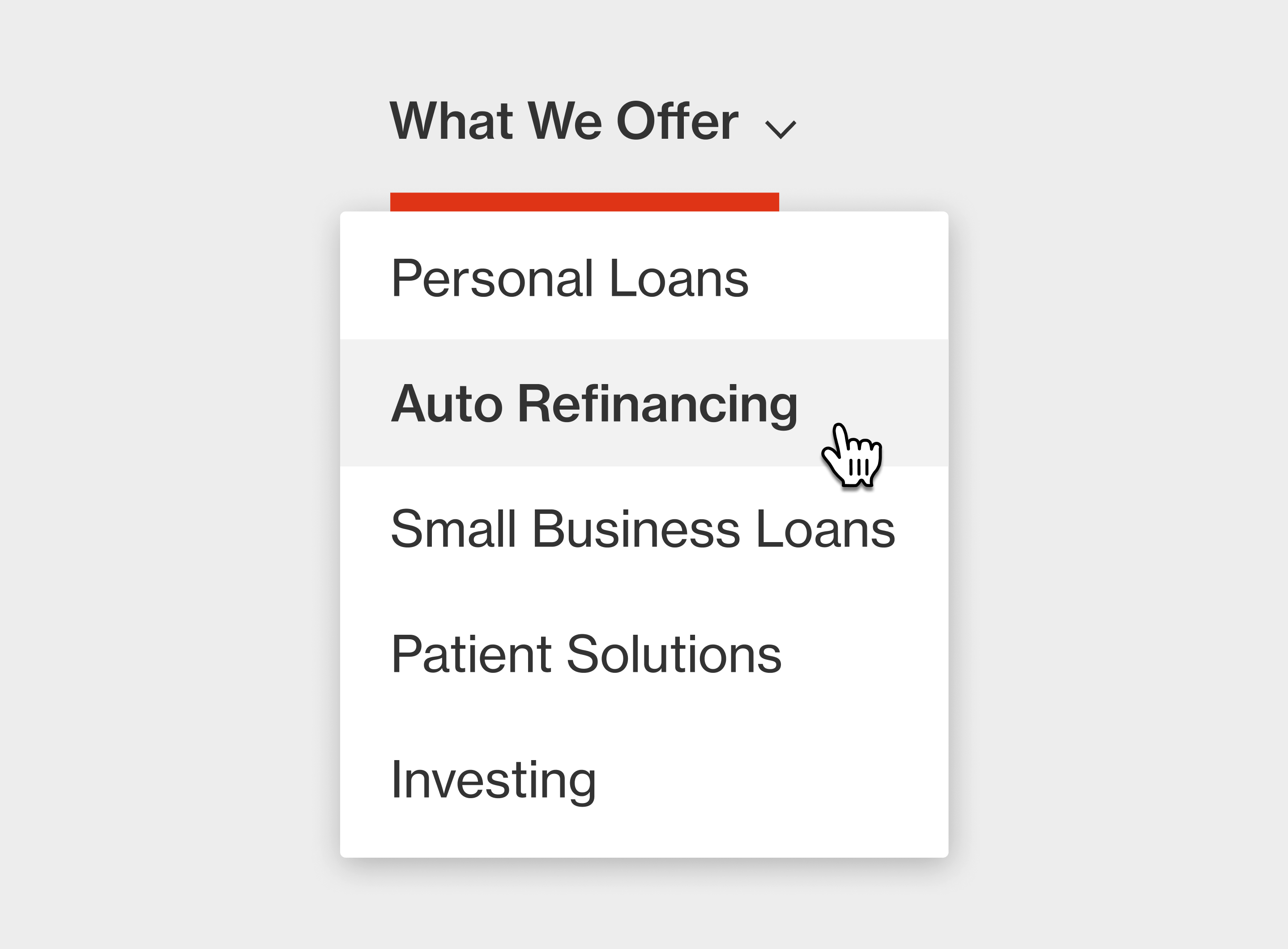
- On the homepage, primary product options were contained to a central “box” that users found overwhelming and confusing. Where users expected to find the main navigation (top) there were further options and secondary links.
- Throughout the product options were bifurcated into “Borrow” and “Invest,” then sub-divided into categories. Users were totally flummoxed.
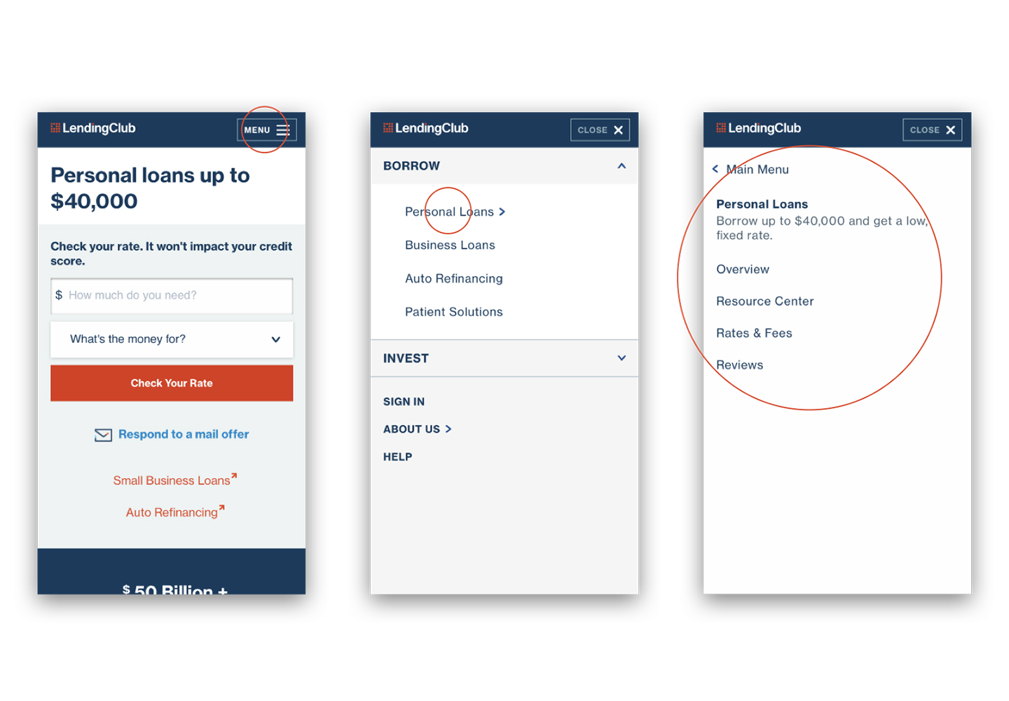
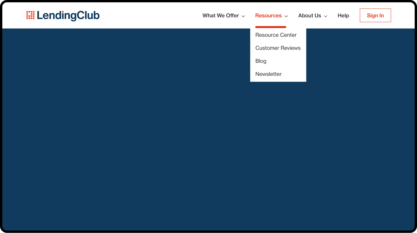
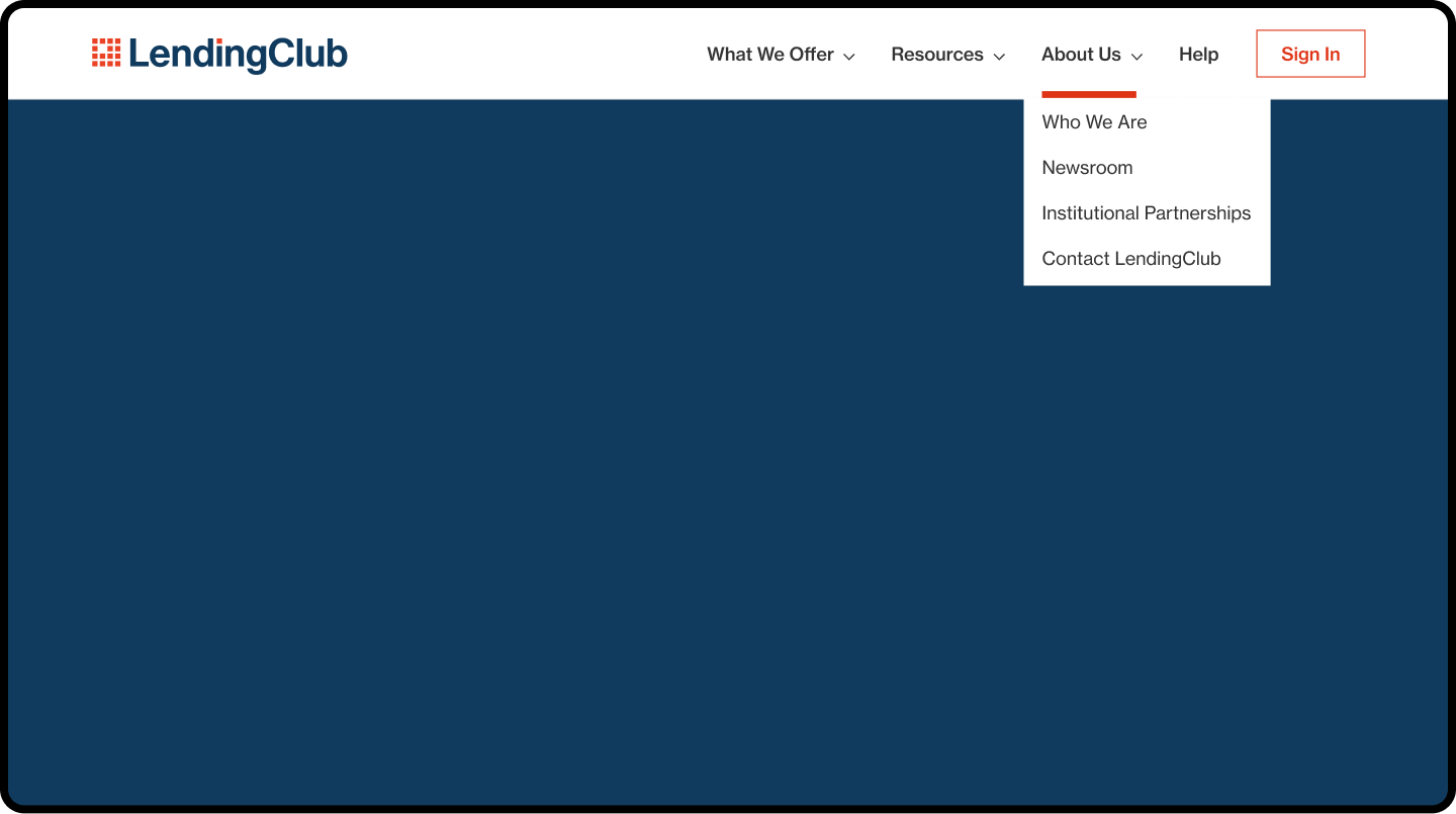
On the road again
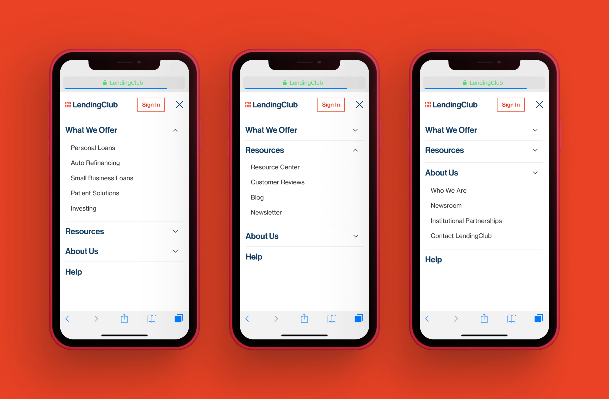
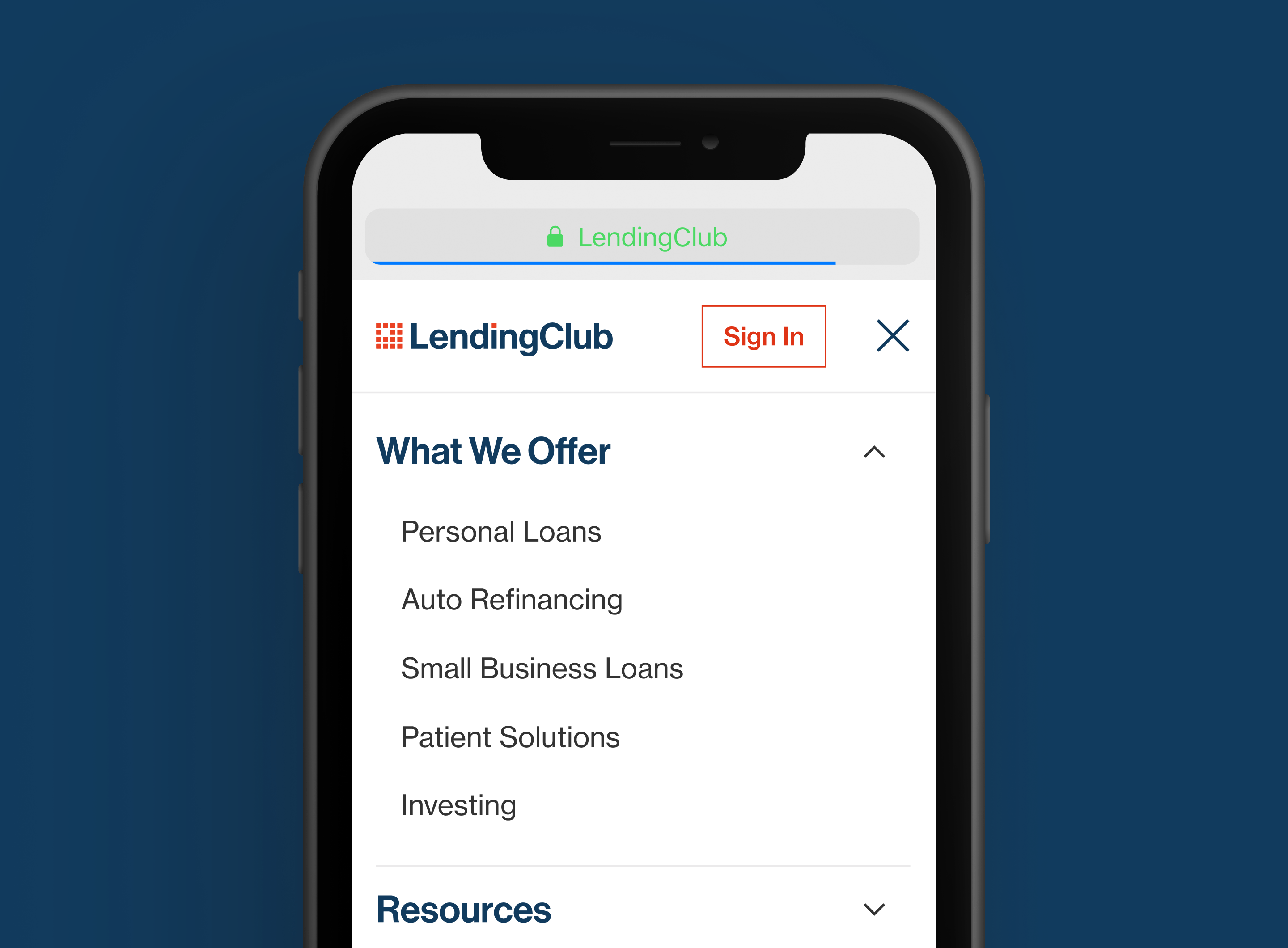
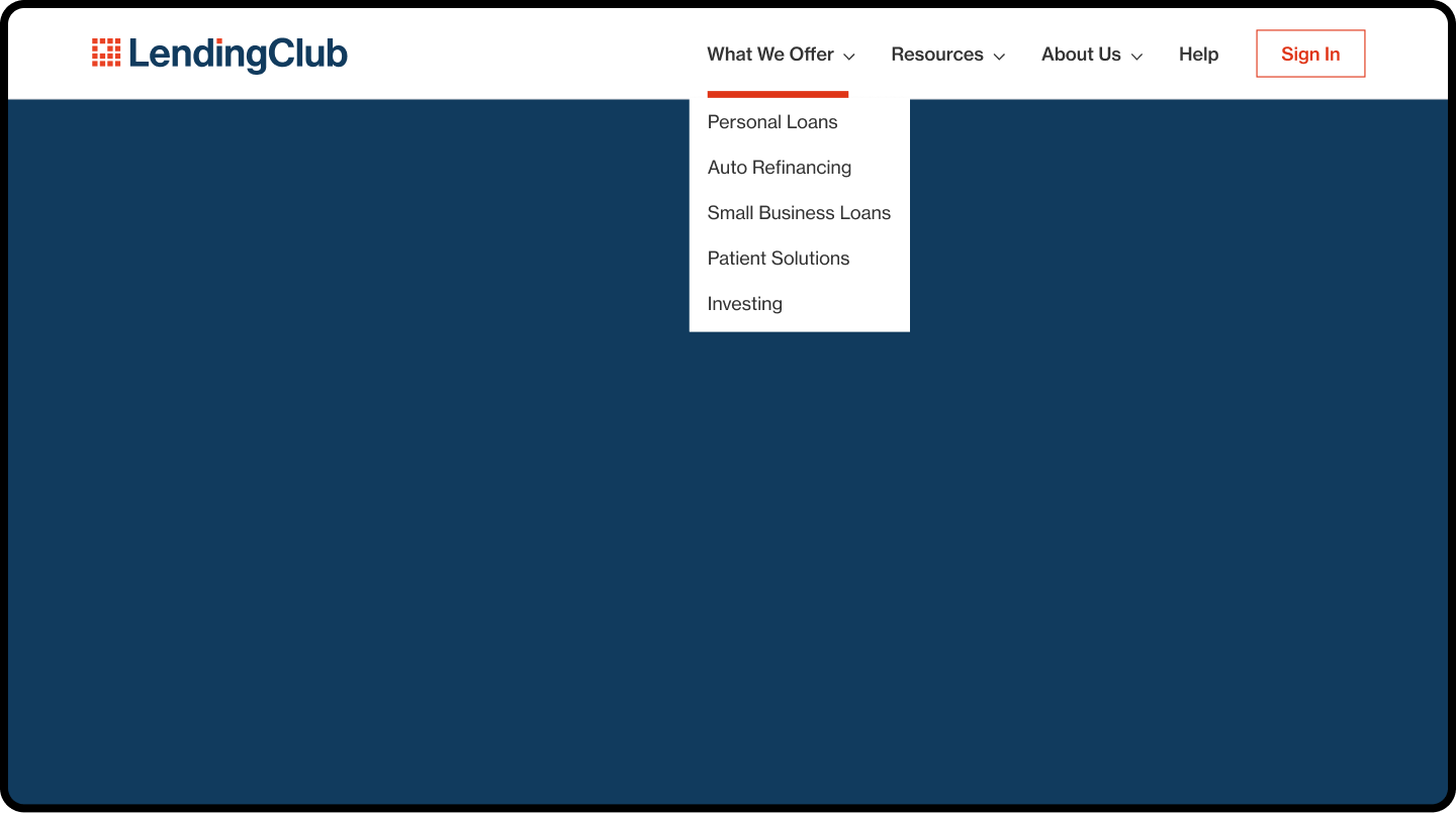
We aligned all product offerings into a single, consumer grouping. Users could get exactly what they wanted with little to no thought or effort. We took that paradigm and made uniform patterns across all regions of the UI.
- Condensed and simplified with a maximum level of two taps/clicks
- Access to “resources” at the top level so users can always learn more
- An option to get help if needed and an easy way for members to sign in
- Expandable to accommodate future products and services
A neutron dance for a neutron fan
Want to chat? Get in touch!
©2025, Eric Weir
All product names, logos, brands and designs are property of their respective owners. All company, product and service names used in this website are for exhibition purposes only. Use of these names, logos, and brands does not imply endorsement.